Peter Krauskopf's Studio, Berlin
The studio of a German painter who redefined monochrome colour — decoded in twelve pigments.
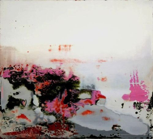
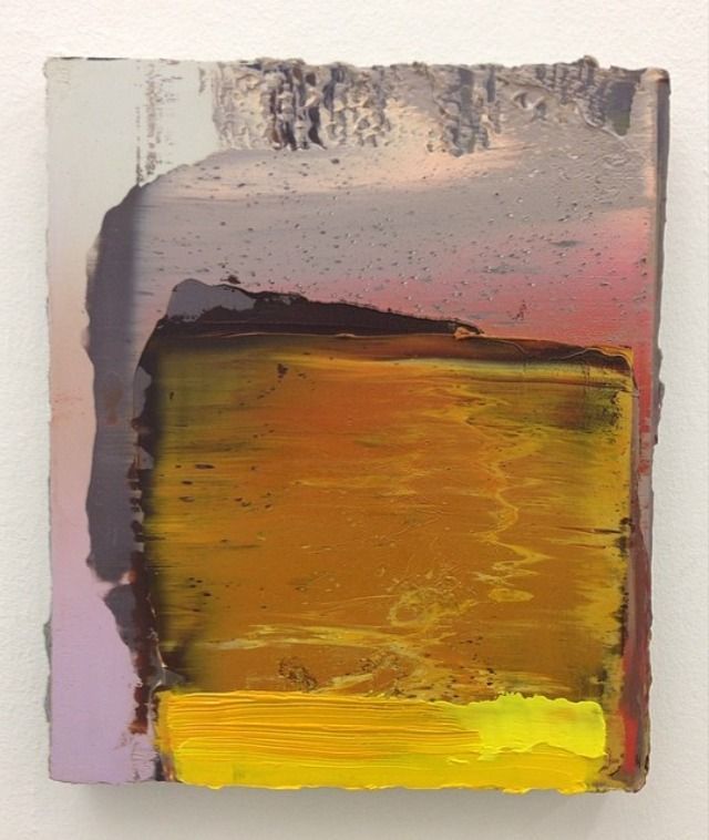
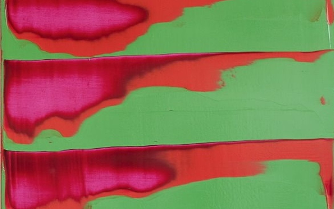
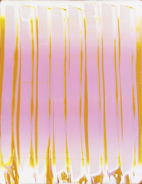
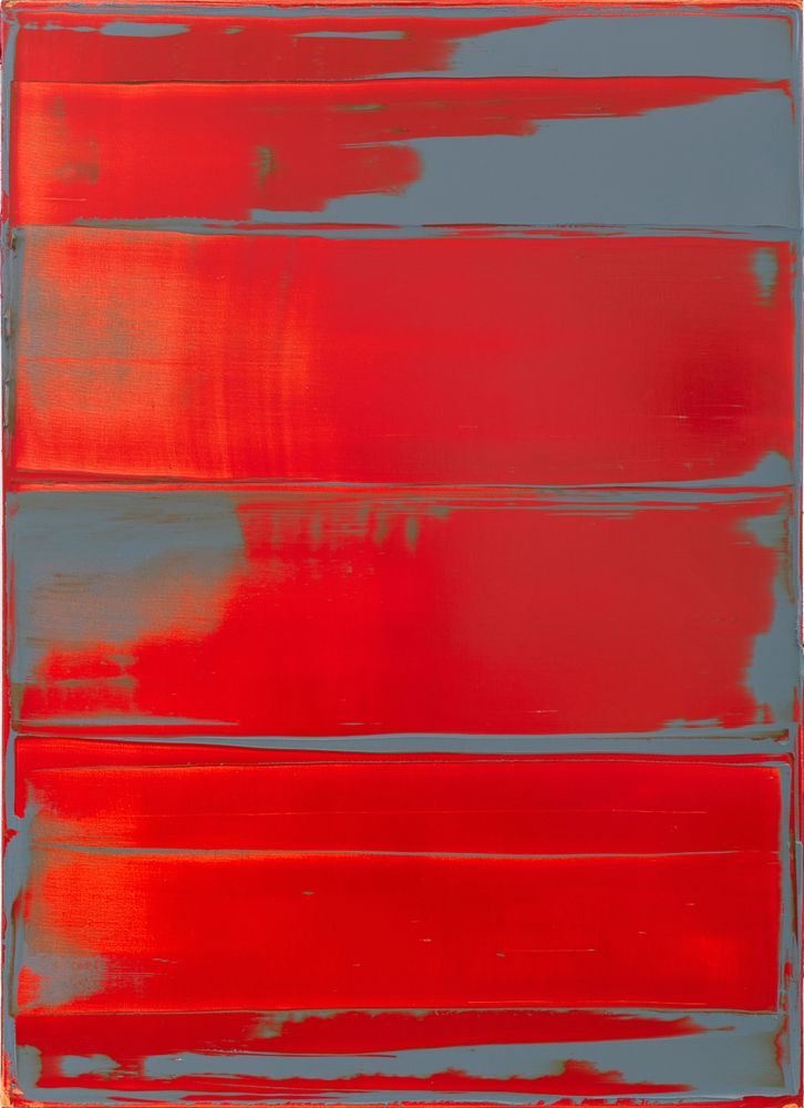
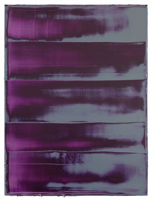
5 MIN · 18 May 2026Peter Krauskopf has painted for thirty years in the same studio in Wedding, north of Berlin — a working-class neighbourhood that Berlin gentrification still, by some good fortune, skirts around. Four hundred square metres beneath an industrial skylight from 1928, raw concrete floors stained with every pigment of the past three decades, and a series of monumental canvases that always seem on the verge of recomposing themselves. His signature: colour, laid down in successive layers — sometimes twelve, sometimes twenty — then scraped back to reveal the strata beneath, like a geologist taking a stratigraphic section through his own painting. Each pigment has a history, and the studio tells thirty years of loyalties and passages. We have decoded the palette in twelve colours.
The studio, in twelve colours
1. Deep cobalt blue
The founding colour, the one he discovered as a student at the Kunstakademie in Dresden in 1988. Each year Krauskopf buys thirty kilos of it from Kremer Pigmente in Aichstetten (Baden-Württemberg) — one of the last manufacturers to grind cobalt by stone rather than by mechanical mill, which heats the pigment and degrades it. Absolute saturation, perfect opacity, and that slight shift towards violet when laid down thickly. An open pot keeps for three years, after which the siccative oil turns rancid and the blue grows dull.
2. Titanium white
To break the cobalt and give body to the upper strata. Krauskopf uses it matt, never glossy — he refuses the modern industrial whites of the Bocour sort that contain barium. Laid onto a still-wet coat, it creates random marbling that remains visible for decades, and which is among the quietest signatures of his work.
3. Light cadmium red
The pigment he uses to sign. A single stroke, bottom right, always the same size (around two square centimetres), always at the same height (five centimetres from the lower edge). An explicit nod to Hans Hofmann, his master in thought far more than Beuys or Richter. Krauskopf calls this stroke his hard core — the one element of a canvas he never reworks.
4. Chromium oxide green
For the so-called "vegetal" canvases, a 2018 series begun after a journey through the Black Forest. A dense green, almost black in places, that turned to grey under certain afternoon light — an effect never reproduced in any other series. The pot of chromium oxide used for those canvases now sits on the back shelf, closed, like a relic.
5. Red ochre from Roussillon
Imported from the Vaucluse, from the Mathieu quarry, where Krauskopf travels once every two years to choose his sacks in person. It is the pigment of his first sold canvas, in 1996, to a collector in Cologne for four thousand marks. He keeps a reserve pot of it that he never uses — out of superstition, he says, and because he paid for it with his first artist's cheque.
6. Ivory black
Laid pure along the sides of the canvases, like a border an inch and a half wide that contains the composition. This detail signs his works as much as the red signature — you recognise a Krauskopf from ten metres by that black border interrupting the field of colour. A pigment made from calcined bone, supplied by an Italian dealer who still manufactures it in the medieval manner.
7. True ultramarine (lapis lazuli)
The most expensive pigment in the studio — around nine hundred euros a kilo. Reserved for a limited series sold at Galerie Eigen + Art in Berlin in 2022. Six canvases only, each with around two hundred grammes of true ultramarine ground on site in aged linseed oil. The lapis comes from an Afghan dealer based in Hamburg, who delivers in sealed sachets.
8. Naples yellow
For the soft grounds. Mixed with white, it gives the characteristic cream that serves as the base for many of his recent works — notably the large 200×300 canvases of the "Voraussetzung" series (2024). Authentic Naples yellow being antimony-based (toxic), Krauskopf handles it with a mask and stores the pot in a ventilated cabinet.
9. Burnt umber
Laid as a very dilute wash, to age a fresh coat that looks too new. Krauskopf calls this his "time filter": he can age or rejuvenate a twenty-year-old canvas in two hours, just by adjusting the dilution. A technique learnt in Florence in 1991, during a fresco workshop at San Marco.
10. Vermilion
True cinnabar — natural mercury sulphide, imported from Almadén in Spain. Toxic (very), so handled with nitrile gloves and an activated-charcoal mask. For details that must vibrate within an otherwise cool composition. Krauskopf uses it rarely, perhaps five times a year, and always in strokes smaller than a centimetre.
11. Payne's grey
A mixture of Prussian blue, ivory black and Mars red. Krauskopf prefers it to the ready-made industrial greys (Daniel Smith, Schmincke), which he finds "dead". He mixes his own batch every six months in a small marble mortar, respecting William Payne's formula dated 1796.
12. True gold leaf
For the borders of only five canvases, his so-called "Byzantine" works, shown once in 2019 at Konrad Fischer Galerie in Düsseldorf and then put away by the artist himself, who deems them too demonstrative. Twenty-three-carat gold, applied with mixtion, supplied by a Bavarian gilder who also serves the restoration workshops of Munich.
The studio ritual
Krauskopf arrives every morning at six o'clock, winter and summer alike. He spends the first two hours preparing his pigments — grinding in oil, diluting, testing on a pine board — before going anywhere near a canvas. He says this ritual is what saves him from "easy" painting: at six in the morning, you either grind conscientiously or you do not paint. No canvas is begun after two in the afternoon. The afternoon is given over to correspondence, to gallerists, and to a long walk in the Tiergarten to decompress.
What the studio teaches us
Krauskopf works as one worked in the seventeenth century — pigments bought raw, ground in linseed oil aged three years in a cellar, laid down in coats that dry for weeks before another can be applied. It is the absolute antithesis of contemporary acrylic painting, which dries in fifteen minutes and lets you finish a canvas in a day. His lesson, though he never formulates it openly: colour is not a swatch chart, it is a substance — one with an origin, a cost, a weight, a toxicity, a geological history. And this substance transforms whoever handles it as much as it transforms the canvas on which it finally settles.
One photo, every piece identified.
Your room, a shop window, an inspiration screenshot: send the photo, we find the pieces and their alternatives at every price.
On iPhone, the app does the same from your camera.
Gallery
6 images