Colour theory applied to interiors: the only guide you need
Colour wheel, complementaries, the 60-30-10 rule: how colours work together in a room — and how to use them without going wrong.
3 MIN · 5 OBJECTS IDENTIFIEDWe think we are choosing a colour; we are always choosing a pairing. The colour wheel is not a school lesson but a decision-making tool: it tells us which of our 25 decorating colours reinforce, calm or neutralise one another. Here is everything that genuinely helps, and nothing else.
The wheel, in thirty seconds
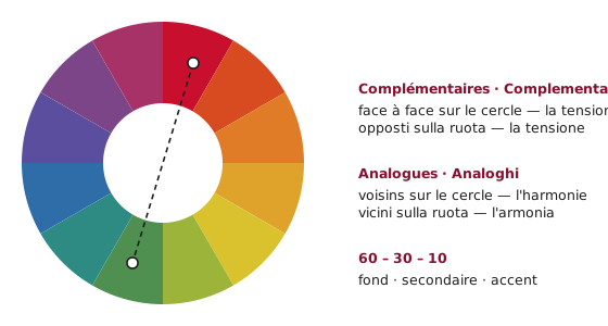
Three primary colours (red, yellow, blue), three secondaries born of their mixtures (orange, green, violet), and the intermediates in between. Every decorating pairing can be read on this wheel: the distance between two colours predicts their effect together. Close by, they harmonise; opposite, they electrify.
Complementaries: tension under control
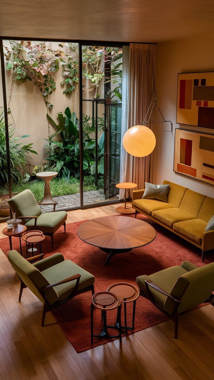
Two colours facing each other on the wheel reinforce one another — it is the most powerful pairing and the most risky. In interiors, we almost never use it pure: we desaturate. The duo of terracotta and sage green is a red-green complementary passed through the filter of time; petrol blue and caramel, a blue-orange complementary turned English club.
Analogues: harmony without effort
Three colours neighbouring on the wheel compose a room that breathes in a single breath — olive green, sage and ochre, for example. It is the pairing of Mediterranean interiors and the safest way to add colour without risk.
The 60-30-10 rule
Proportion makes elegance: 60% of the room in a background shade (walls, large furniture — often a neutral such as beige or off-white), 30% in a secondary shade (sofa, rug, curtains), 10% as accent (cushions, lamp, ceramics). The accent is the only place where the bold colours — coral, mustard, emerald — give their all without tiring the eye.
Warm, cool, and the light of the room
Warm colours (reds, oranges, yellows) advance and visually shrink; cool ones (blues, greens) recede and enlarge. A north-facing room, with cool light, warms up with ochre or rust; a south-facing room can carry deep cool tones such as indigo. Always test a sample on the actual wall, morning and evening: a colour exists only in its light.
The mistakes that cost a pot of paint
Testing a shade on a 3 cm swatch instead of an A2 sheet moved from wall to wall over 48 hours. Painting a single “accent wall” — the 2015 trick that cuts the room in two; today we wrap (walls, skirting boards, sometimes ceiling) in the same shade. Ignoring undertones: two beiges can fight, one leaning pink, the other yellow — always compare them side by side against pure white. And wanting everything to match: a perfect pairing looks like a hotel room, a slight friction looks like home.
The Beyit tip
Paint an A2 card, not the wall: you move it from the north side to the south side, from morning to evening, and the decision is made in two days instead of two regrets. And remember the hierarchy: the most expensive colour to get wrong is the one on the sofa, not the one on the wall — a wall can be repainted for £40, a sofa cannot be redyed.
And how to find furniture in the right shade?
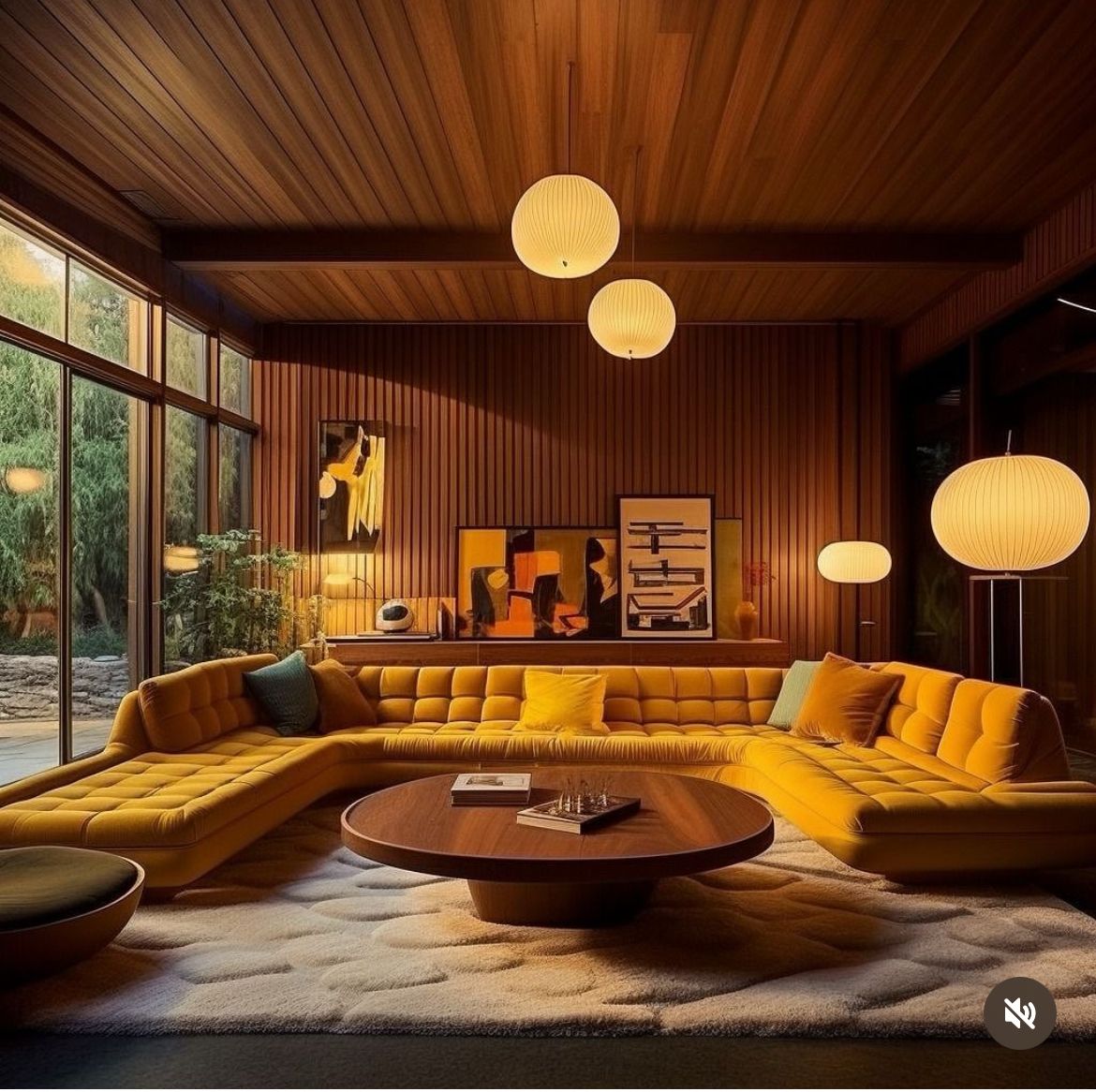
Each of our colour pages lines up the catalogue furniture in the exact shade, from premium to affordable. And if a colour catches your eye in an interior photograph, scan it: Beyit identifies the furniture that carries it.
One photo, every piece identified.
Your room, a shop window, an inspiration screenshot: send the photo, we find the pieces and their alternatives at every price.
On iPhone, the app does the same from your camera.
The pieces, at your budget.
Every piece mentioned, with its alternatives — from vintage to dupe.


